Zippo’s Art Concept
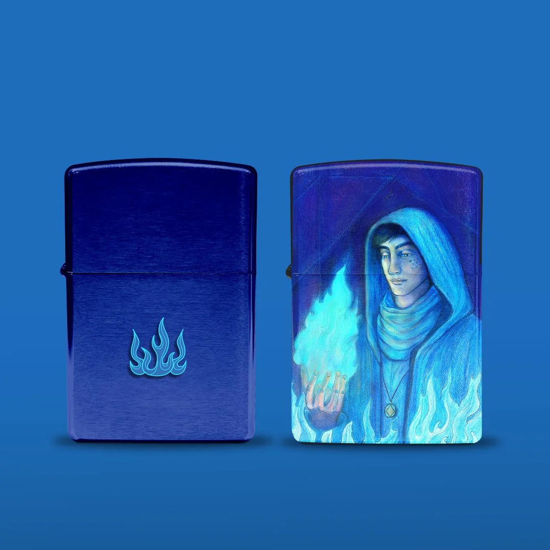
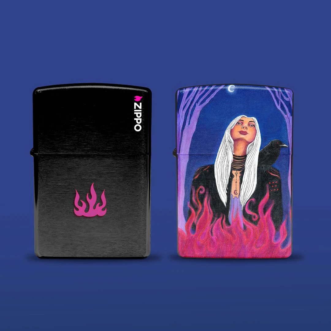
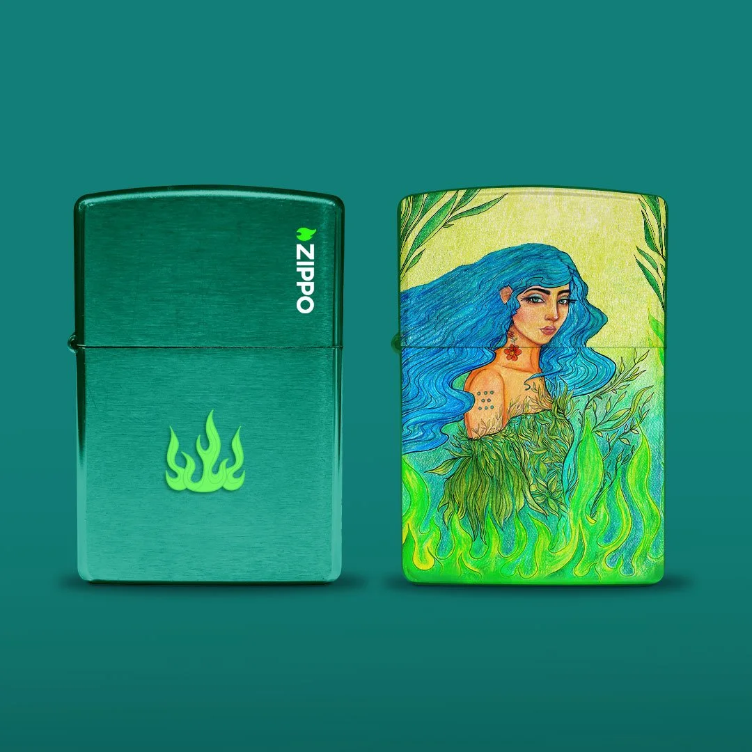
This illustrative concept includes three key visuals, product shots, print and outdoor. The use of colour schemes conveys the message of rebellion, freedom and discovery. Each symbolic and relevant to Zippo itself.
The intention is to merge an artistic direction with Zippo as a brand. The product utilities that were selected are longevity and durability. The symbolic intersection of the product value with the brand’s symbolism is key to highlight how each user relates to it personally.
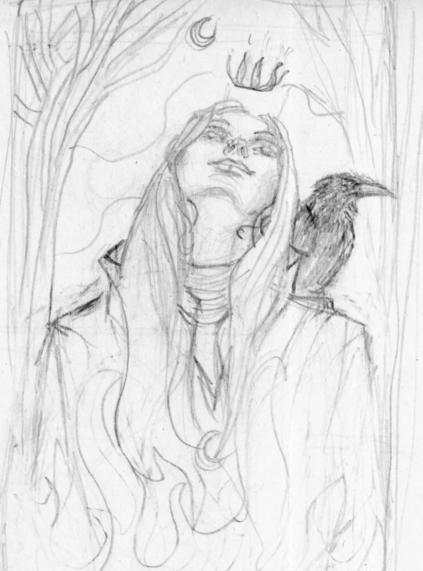
Inspired by the 8 dots of zippo, the crown reflects an individual’s power and resilience through freedom, rebellion and discovery.
The crown design
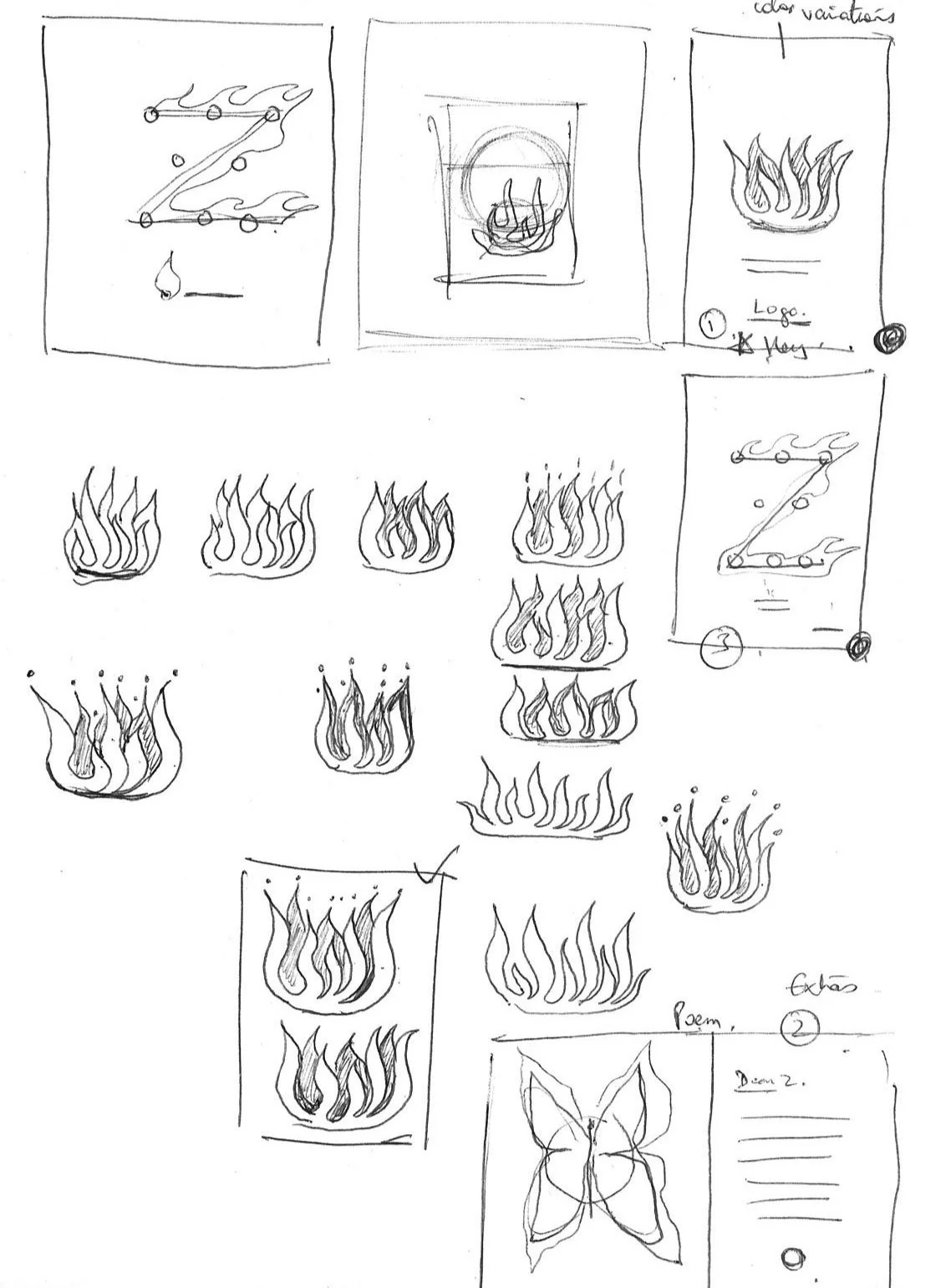
The flame keeps going
After some research, the idea was to create a visual story through art for its collectibles edition.
The project focuses on the core message of resilience while bringing a more artistic approach to the brand. The symbolic association reflects how it’s not just about the lighter but the strength it lights within.
One of the collaterals also includea a print ad concept called Letter to Zippo as a personal message about what it means to own a Zippo lighter.
Dear Z,
I keep you in my pocket, a personal treasure,
Your resilience I find is beyond measure,
When the world goes dark in the night,
You spark the flame that holds the light,
Unwavering now, there is comfort in knowing,
That against all odds, the flame keeps going.
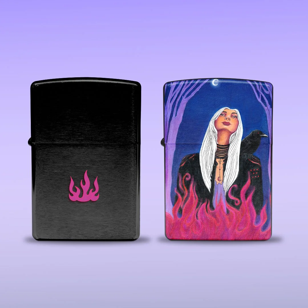
Light your flame posts
